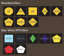
The Star Wars FFG dice become a more complex issue as the dice have different colors, representing the specific dice from the game they are used in. Without changing the color of the represented dice, I believe the change I provide makes the words within much easier to read while providing ratios that appropriately meet the requirement by the WCAG. Because the words often overlap with the background, it is difficult to suggest a single-color hexadecimal number that has an appropriate ratio for both the vast colors of dice as well as the dark background. For this reason, I believe an easy fix to these dice is a slight redesign. My suggestion is that the dice should have a horizontal rectangle with the same color of the background (#231F20) bisect each die. Afterwards, change the color of the text within to #FFCC33 which is the same yellow found throughout the website that has a proven readability against the background of #231F20. By creating a new bounding box for the text, no matter which die is in question, the ratio is sure to be maintained as well as the theme of the website.
For tabletop roleplaying gamers adventuring into the wonderful world of fantasy, sci-fi, horror, or wherever their board game journeys take them, creating a token that brings to life the characters they have chosen to play is an essential part of the adventure. This is where the website RollAdvantage.com comes in handy. With this very easy-to-use site, users can freely create and generate tokens, used as the player's game pieces, that visually showcase their place on the virtual table. The mission of RollAdvantage is to "aim to be easy to use, fast and accessible on the fly, and optionally in-depth if possible to make a Game Master's (GM) life easier" (RollAdvantage). Having used this website numerous times in the past, I am familiar with the various tools utilized to make this possible, most notably, a token generator as well as a dice roller. Outside of this, the website may have other niche uses, but it is clear that these aspects would not be its main purpose.
Throughout this article, I will focus on reviewing RollAdvantage from my own personal use of it while applying the design policy of the CRAP (Contrast, Repetition, Alignment, Proximity) principles. In my efforts to improve the website, I will be sure to make reasonable changes that I believe will make the website more accessible to users. Additionally, I would like to state that my purpose is not to threaten the original design or mission that the website was built on. Maintaining the identity of RollAdvantage as a tool for players is of the utmost importance while I researched ways to adjust the website that I feel align with the principles of CRAP in an online environment. In following these design principles I believe that RollAdvantage can have a clearer and more defined identity online.
With wonderful tabletop roleplaying games such as Dungeons & Dragons, Call of Cthulhu, City of Mist, and Starfinderevolving into the digital sphere and becoming widely available online, tools that once existed, such as, battle maps, dice, tokens, and rulebooks must also transition into the digital world. RollAdvantage comes into play as a website containing a handful of these helpful tools. Supporting its primary audience of tabletop role-players, most significantly the GM, as stated in the website's mission statement.
As an overview of my understanding of how the website works, of the two primary tools found on the website, the token stamp tool seems to be the main focus. From my experience playing Dungeons & Dragons online, I have utilized this tool to create countless tokens for players, non-player characters (NPCs), monsters, and various other creatures in a matter of seconds. On the surface, the tool provides an assortment of premade token border shapes, a color selector, fonts, and other sub tools that allow users to customize their tokens as they please. The only requirement is for the user is to provide an appropriate image, place it within the tool, and adjust it as desired before clicking download. The website then saves the generated token to the Downloads folder as a PNG and can be used freely by the user.
The dice roller tab, however, seems to be an additional add-on. Until recently, I didn't even realize the website offered a dice roller tool. The tab possesses the baseline functionality of what you'd expect from a dice roller, requiring the user to select a die and simply roll it, generating a random number within the die's range. The inclusion of this feature is useful, though from my experience most online tabletop websites have built-in dice rollers already available to utilize. Notably, however, is the inclusion of a set of dice for a very specific tabletop game I am unfamiliar with, so this niche in design could have the tool utilized then my understanding of it, though I wouldn't be able to tell.
RollAdvantage is clear in its purpose, a website designed as a resource for tabletop roleplaying games. While the website is more geared towards the GMs who run the tabletop games online, a secondary audience of your website could be for players within these games who want to create their main playable character. While a GM will create countless tokens to fit multiple roles, this secondary audience may only use the website a handful of times, but still get just as much use from it.
When looking specifically at functionality, the website's simplicity creates an easy experience for most users. The website is divided into four main pages, the home tab, the token stamp tab, the dice roller tab, and the about tab. These four tabs are arranged at the top of the screen for easy navigation, all sharing similar sizes. The current page tab a user has selected is highlighted red. Throughout the entire website, the similar colors of red, yellow, and brown are shared on all pages using the font Aleo. Each page is designed with brown bounding boxes centered on the screen with white font and links highlighted yellow to match the color scheme. The website's pages are kept free of unnecessary clutter and follow the same formatting, alignment, and core structure of the page prior. This creates a cohesiveness across the entire website and further demonstrates the core foundation that RollAdvantage is a quick and easy tool for players to use.

(Home tab of RollAdvantage.com)
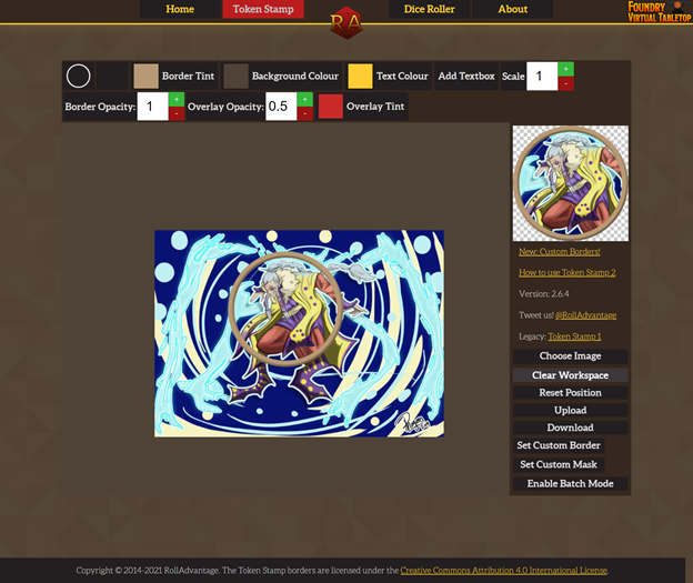
The main purpose of the website as I have described is the token stamp tab. With this in mind, it would make sense that the website's primary goal is to ensure that the token stamp functionality is easy to understand and use. Like the Home page, this tab contains the same fonts, colors, and layout as the rest of the website.

(Token Stamp tab with an image imported. Image provided was drawn by me. The completed token example is shown in the top-right of the tool window.)
The ease of functionality on the Token Stamp tab is very important since token generation is the websites' primary function. The ease of using this tool on the website is essential for the mission provided by RollAdvantage and helps establish its niche for the online gaming community. The tab itself leaves a large canvas for users to work with and allows them to freely move, resize, and rotate the images they provide to create their desired token design, which is displayed on the top right side of the generator. From the few windows in the middle of the toolbox, a few of the options, such as the white circle, provide a folder in which an assortment of premade token borders is already created and can be freely utilized by users.

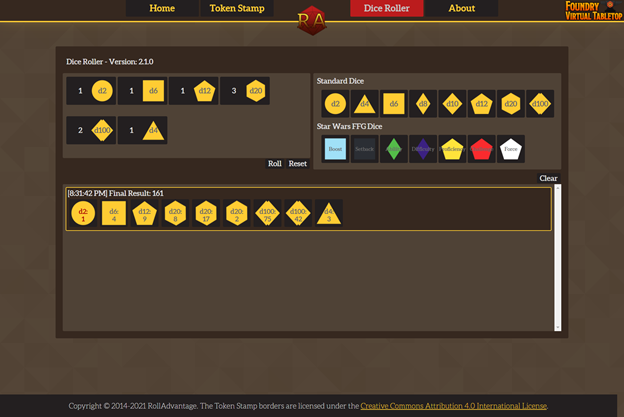
(Dice Roller tab of RollAdvantage.com with a random assortment of dice rolled.)
The dice roller tab, arguably a secondary tool for the website, shares some similarities with the Token Stamp tab, presenting an array of buttons, most notable buttons labeled dx (x representing any of the given dice ranges for the respective die) for users to choose and access the generator. The functionality of this page is as simple as it sounds, essentially boiling down to selecting the desired die, however many are needed. Next, a user can roll them to produce a randomly generated number between the ranges of the die. The page itself doesn't have any major functionality issues and this may be directly linked to its simplicity. It performs its job, being a random dice generator, though offers nothing unique to separate itself from other dice rollers other than the inclusion of a set of dice called Star Wars Fantasy Flight Game (FFG) Dice, which I can't speak towards as I have never played the game.
The final tab on RollAdvantage is the about page which repeats the websites mission statement, contains links to the third-party resources, the website uses, and credits the creators of the website. This tab holds no real purpose for the website's primary objective, instead it is just utilized for assigning credit where credit is due. It maintains the same overall color scheme, font, and design of the website without deviating from any motifs or patterns found on previous pages.
The simplicity of this website allows users to quickly gain access to the token generator without the disruption of ads, hidden tabs, paywalls, distracting popups, or any other nuisances that may hinder the primary objective of the site. Overall, the functionality and design of the website is clean and clear. This gives tabletop gamers the ability to utilize its primary tools with little hassle or confusion and meets the needs of those looking to create game-ready tokens capable of being imported into any online universe.
Outside of a few structural and language identifiers for screen readers, the website's only glaring issues are a few instances of contrast ratios. The issues with the website's contrast make certain elements more difficult to see or read. I believe that these few problems can be solved rather quickly to help ensure those who have a harder time reading those lower contrasting areas are not left out, while still maintaining the site's overall integrity.
Overall, I feel the current website has a strong structure in design as it follows most of the CRAP principles, allowing for an easy and hassle-free experience. The font that is used throughout the website is Aleo, a serif web font, and is consistently at the size of 13.5 for all the main text. While this font is easy to read, it may not be the most appropriate. According to Gert Svaiko, Sans-Serif fonts are more appealing stating, "...Sans-Serif fonts can be efficiently used in modern devices because the letters require less space. However, these fonts also embody cleanliness and clarity, which mainly shows for companies that have straightforward agendas and no fluff around them" (Svaiko). Because of the website's straightforwardness, I recommend choosing a web-safe Sans-Serif font to match this motif. Svaiko suggests that the other option, being system fonts such as Arial, Helvetica, Futura, and Calibri can be poor choices clarifying, "the downside of using system fonts is that it's challenging to stand out if everything looks the same. This is where web-safe fonts come in handy, which are a collection of common fonts available across platforms and systems. They are supported in multiple languages, there are no licensing costs, and they unite the application's look and feel" (Svaiko). With this mindset, RollAdvantage could benefit from finding a web-safe font as described to help keep the website unique while also updating the site with font that is more appropriate for a computer screen.
While most of the websites use of contrast ratios, color choice, text, hyperlinks, and button links are acceptable, the issue of bad contrast ratios becomes glaring when you realize that they are found on the Dice Roller and Token Stamp tabs. This is a problem considering the website's primary goal is to be utilized as a tool for its users and if there are visibility issues on the tabs that function as the main tools, then users could struggle to use the website effectively. On the token page, there are icons that indicate the additive of a number and subtraction of a number, represented by a green and red box with a grey "+" and "-" within them respectively.
(Example of button pulled from rolladvantage.com/tokenstamp. Website's Original: Left My Edit: Right.)
These buttons do not meet the Web Content Accessibility Guidelines (WCAG) which requires a ratio of 4.5:1 as a minimum. Currently the green buttons have a ratio of 1.89:1 which is much lower than required. Using the WAVE web accessibility evaluation tool and changing ratios, the color ratio I have chosen instead is #FFFFFF which is standard white against #2E8540 which provides a darker green and a ratio of 4.62:1. This slight edit can help improve readability and doesn't impact the overall theme of RollAdvantage.
On the token stamp tab, the same properties can be addressed focusing on the readability of the dice icons themselves.

(Example of the Dice Roller section with the buttons in question from rolladvantage.com/diceroller)
These icons can be increasingly hard to read and can benefit from the same adjustments utilizing the WAVE tool. The yellow dice along the top use the colors #FFCC33 for the yellow icons and #696969 for the grey within. I believe an easy fix is to change the color of the grey within to #231F20. This not only brings the ratio to 10.81:1, but also follows a similar pattern to the website, having the same exact coloring as the tabs along the navigation bar. Through the CRAP principles, Klein and Shackleford define repetition as, "...the use of consistency to visually group multiple items that express similar ideas or are somehow related," (Klein and Shackleford 336). Though their article focuses on text specifically, I feel the same visual principle can be shared for the website's overall visual theme. Using a consistent color palette and theme can solidify the website's identity.
"Table Top RPG Tools." RollAdvantage, rolladvantage.com.
The website navigation is designed rather well and doesn't seem to need many changes as a lot of its principal navigation follows patterns and repetition. The two main tabs, being the resources for the site, use iconography and clear identifying text to make it easy to understand which tab you are traveling to and which tab you are on. While it may seem redundant, the tabs contain the names of the resource they represent and when viewing those pages, the name of that tab appears multiple times. On top of this, the buttons are large clickable boxes, spaced away from each other to avoid clutter and unintentional mis-clicks. Kara Pernice, the Senior Vice President at Nielsen Norman Group, describes some of these designs choices as very beneficial for senior users. She claims that these navigation designs quote, "...help recognize where they are rather than forcing them to recall what they've done" as well as "make link and button targets large enough to click or tap and leave plenty of space between them" (Pernice). This ideology further confirms the choice in design of RollAdvantage.com. I believe that maintaining this navigation is beneficial simply because even with the evolution of tabletop games to a digital environment, these types of games have been around for decades and considering veterans of the game for the website helps maintain an inclusive design.
All in all, while RollAdvantage may be a smaller website with some minor design issues it is still an effective tool for tabletop gaming no matter the user. My redesign proposals highlight only a few changes to increase readability as well as the repetition of theming on the two resource tabs (Dice Roller, Token Stamp) to maintain consistency. The proposals are an edit to important buttons as well as a reconsideration for the website's font. I believe that this website successfully demonstrates how simple design principles, and a strong goal can create effective and successful tools for its users.